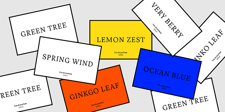
Vesterbro
Vesterbro
字体说明
Vesterbro
字体英文名称:Vesterbro-Light.TTF

Vesterbro
品牌:
Black[Foundry]
设计师:
Alisa Nowak, Ilya Naumoff,Jeremie Hornus
发行时间:2018
字库编码:
Unicode
分类:
衬线体
字体属性:
字体介绍
Vesterbro是Black[Foundry]的新衬线字体,以哥本哈根老西门曾经所在的市区命名。这是JérémieHornus的创意,他与Alisa Nowak和Ilya Naumoff合作开发了该类型系列。
Vesterbro系列的核心设计是Poster。富有想象力的高对比度字体结合了Scottish字体和Garalde字体的特征。 Vesterbro Poster比大多Didot字体在展示上显得更亲和。
它具有友好的形状,具有宽大的x高和短衬线。倾斜的轴和柔和的曲线使Vesterbro Poster具有诱人和快活的个性。只需看看小写字母“ e”上那灿烂的笑容,或“&”号如何连接下一个单词。该团队对这种印刷混搭的工作效果感到惊讶,得出了具有相同属性的文本版本。
常规砝码的衬线字体更加明显,对比度也很低,在页面上显得沉稳而自信。字母“ a”,“ c”和“ f”上的末端增加了优雅的书法风格。随着重量的增加,字体在不失去柔美魅力的情况下获得了冲击感。感谢Black [Foundry]的跨国团队,在Vesterbro开发的早期就添加了希腊字母和西里尔字母。
全面的字符集包括多种类型的数字,广泛的连字集和完整的箭头补充。 Vesterbro的文字大小令人愉悦,大尺寸使用时会引人注目,它是一种用于全球交流的通用类型系列,可应用于任何设计项目,从编辑设计和图形标识到广告,品牌和包装。
"Named after the city district located where the old Western Gate of Copenhagen used to be, Vesterbro is an attractive new serif face from Black[Foundry]. It is the brainchild of Jérémie Hornus, who developed the type family in collaboration with Alisa Nowak and Ilya Naumoff
The core design of the Vesterbro family is the Poster weight. The imaginative high-contrast typeface combines characteristics from Scottish and Garalde models. Vesterbro Poster is warmer than most Didot-inspired display faces.
It has friendly, organic shapes, with a generous x-height and short serifs. Its tilted axis and supple curves lend Vesterbro Poster an inviting, jovial personality; just look at that radiant smile on the lowercase ‘e,’ or how the ampersand licks the next word. Surprised at how well this typographic mashup works, the team derived a text version with the same properties.
The Regular weight has more pronounced serifs and a fairly low contrast, giving it a calm yet confident look on the page. Leaf terminals on letters like ‘a,’ ‘c,’ and ‘f’ add an elegant calligraphic touch. As the weight increases, the typeface gains impact without losing its supple charm. Thanks to the multinational team at Black[Foundry], the Greek and Cyrillic alphabets were added early in the development of Vesterbro.
The comprehensive character set includes several types of numerals, an extensive ligature set, and a full complement of arrows. Pleasantly readable in text sizes and attention-grabbing when used big, Vesterbro is a versatile type family for global communication that can be applied to any design project, from editorial design and graphic identities to advertising, branding and packaging."
字体下载地址
***特别提示***
1、本站所有资源仅供学习与参考,请勿用于商业用途,否则产生的一切后果由您自己承担!
2、字体用于商业用途,需要自行与权属方联系并取得书面授权,该授权可能需要您支付相应的版权费用。
3、免费下载不等于免费商用,请牢记,商用请联系资源版权方购买授权!。
4、如有侵犯您的版权,请及时联系978767986@qq.com,我们将尽快处理。


